Areachica
30 aug - 22 sep 2021
AreaChica is a web based B2B e-commerce platform that launched in August 2021 in Sweden. Their goal is set to take a global market. The idea came during the pandemic when face-to-face meetings were not possible. What if the B2B market also could take the step into the digital world just like B2C already had done?
The idea is that buyers and sellers meet in AreaChicas platform to make business. Sellers have a company profile in AreaChicas showroom where they market their company’s offers. The buyers search for companies to invite to different forms of procurement. AreaChica offers agreements and other things to ease the deal. The school (Changemaker Educations) divided us in to groups of five and gave us a total of 3,5 weeks to complete the task.
The team and I
I took on the role as a project leader and facilitator in this project. I had a great team where we helped each other when support was needed in any area that we needed to focus on.

Albin Carlsson
Decider

Denise Swartling
Project leader
& facilitator

Kim Zhang
Prototyper

Libin Abdulkadir
Interviewer

Lina Stenharg
Report
The brief
As UX Designers we came in two weeks after their launch, hence, there was not much data to go on. In this short period of time stakeholders at AreaChica saw three areas of their service that needed to be solved.
One of these areas was the registration process and the completion of a company profile in their showroom;
AreaChica clients get access to the platform in a self-onboarding process. Clients must register basic company and personal information to get started. Thereafter the client must complete their own profile and build their Showroom. What we see is that clients start to build their Showroom but without completing the necessary info.
This gives us a problem as the Showroom looks half done and we have to manually contact the client and help them. How do we engage the user to 100% profile and Showroom completion during the registration process?
The other two tasks focused on listing ads in their online store and getting more engagement in forums. Two interesting tasks, but after voting we all agreed that trying to solve AreaChicas challenge regarding the registration- and company profile process was that we wanted to focus on. We also decided to focus on the experience for sellers as a target group.
Understanding the challenge
We decided to start off by putting ourselves in a seller’s shoes when entering the webpage, going through the registration process and completing a company profile for the showroom. We also interviewed the stakeholders at AreaChica to fully understand their business idea and what they want to offer their customers.
Apart from that we also researched experiences regarding onboarding and completion of profiles and tested out processes at other platforms.

Understanding users
AreaChica were very generous with giving us accessibility to their current clients. Since the webpage launched just a couple of weeks before we took on this project, the current clients still had good remembrance of the registration process and how they took on the creation of a company profile.
We interviewed a total of three current clients and tested the onboarding process with another five persons that were not current users of AreaChica. All us students also shared our insights from current users with each other to get out as much as possible.
Key take aways from interviews &
first user test on current platform
From the interviews with current users, we found that all of them were very interested in the idea with Areachica, they believed this was the future and wanted to be a part of it. The registration process felt too long and the information needed too demanding at this stage of the onboarding process.
Even though some information was voluntary, it took up space and the user did not understand what the information was going to be used as. The users also had some problems with navigating around the first page after the registration process and wasn´t sure of the next step.
We had similar experiences with the five non-current users we tested the current platform on. However, they also gave us insights about the start page of AreaChica. They were a bit unsure about what AreaChica offered and therefore, not totally convinced of why they should register.
How might we?
When organizing our how-might-we questions we saw that the things we wanted to focus on was engagement, feedback and making things simple and smooth for users.

Our goal and three hypotheses
We soon realized that to help AreaChica with the registration and completion of a company profile we had to solve three areas. Therefore, our main goal with the whole project was:
We want to create and show the value for using AreaChica to the user, we want to simplify the registration process and give motivation to create a company profile.
- By creating and presenting the purpose of AreaChica on the start page we will give the user a sense of why they should register and hence give them a value of the platform.
- By scaling down, splitting up and adding a progress bar will ease up the registration process and hence, be simpler for the user to go through.
- By creating a welcoming and purposeful start page once registered, will give the user a sense of meaning and motivation to create a company profile.
Time for some design and user tests
We did a total of five user tests on our own design that we created using Figma.
User test 1
In the first user test we tested four different flows with different ideas we had. Those ideas were different types of start pages, registration processes, tutorials, start pages once the user is registered, and different ideas on how to start creating the company profile. And last but not least, a couple of pages confirming that the user had completed what needs to be done in the platform.
The ideas the users liked we took with us in the next set of iteration.

Image showing a flow in Figma designed for user test 1.
User test 2
In test 2 we went over our design ideas from user test 1 and modified them into a single flow. The ideas we re-designed was:
- A start page with more information about AreaChicas offer and what to expect
- A registration process with the possibility of going through a tutorial with the most important features in the platform according to a sellers perspective. If the user says yes to the tutorial she/he also have the possibility to start creating a company profile after the short tutorial is done.
- A start page once you are registered. Depending on if you took the tutorial or not it will look a bit different to the user. The user will see what has been done and what needs to be done in a to-do list. If they haven´t started creating a company profile we added tooltips in form of a speech bubble to encourage the user to start creating the profile.
- Since we had scaled down the registration process, we had to look over the creation of a company profile. Our idea, that we backed up with research and user tests, was that it is easier for a person to create when they see it happening in front of them. Therefore, we created a company profile where the user saw what was needed and could see it taking form in real life by adding text, media and/or videos.
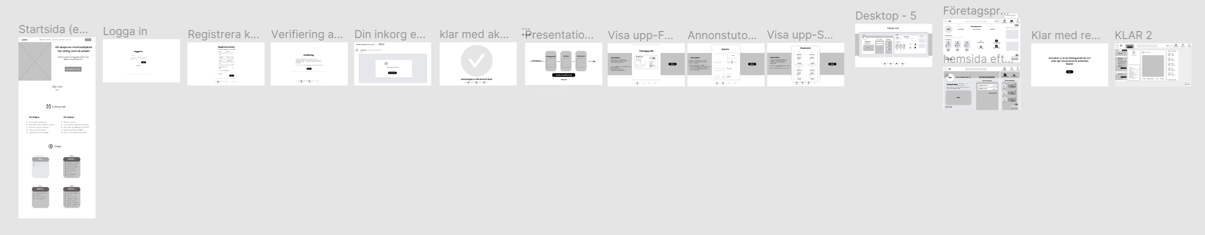
Image showing a flow in Figma designed for user test 2.

Image showing different designs of a homepage once registered.
User test 3
In test 3 we felt confident with the flow but a bit unsure of the design at a couple of frames, one being the starting page once the user is registered.
We came up with a couple of different frames and tested them with five users.
User test 4
At the last test we had our high-fidelity prototype ready with one flow and the right design according to our user tests.
The overall results were great. We had tested our concepts many times so we felt happy with the product. There were some minor things that we corrected but unfortunately didn´t have time to test again.
Our design - homepage
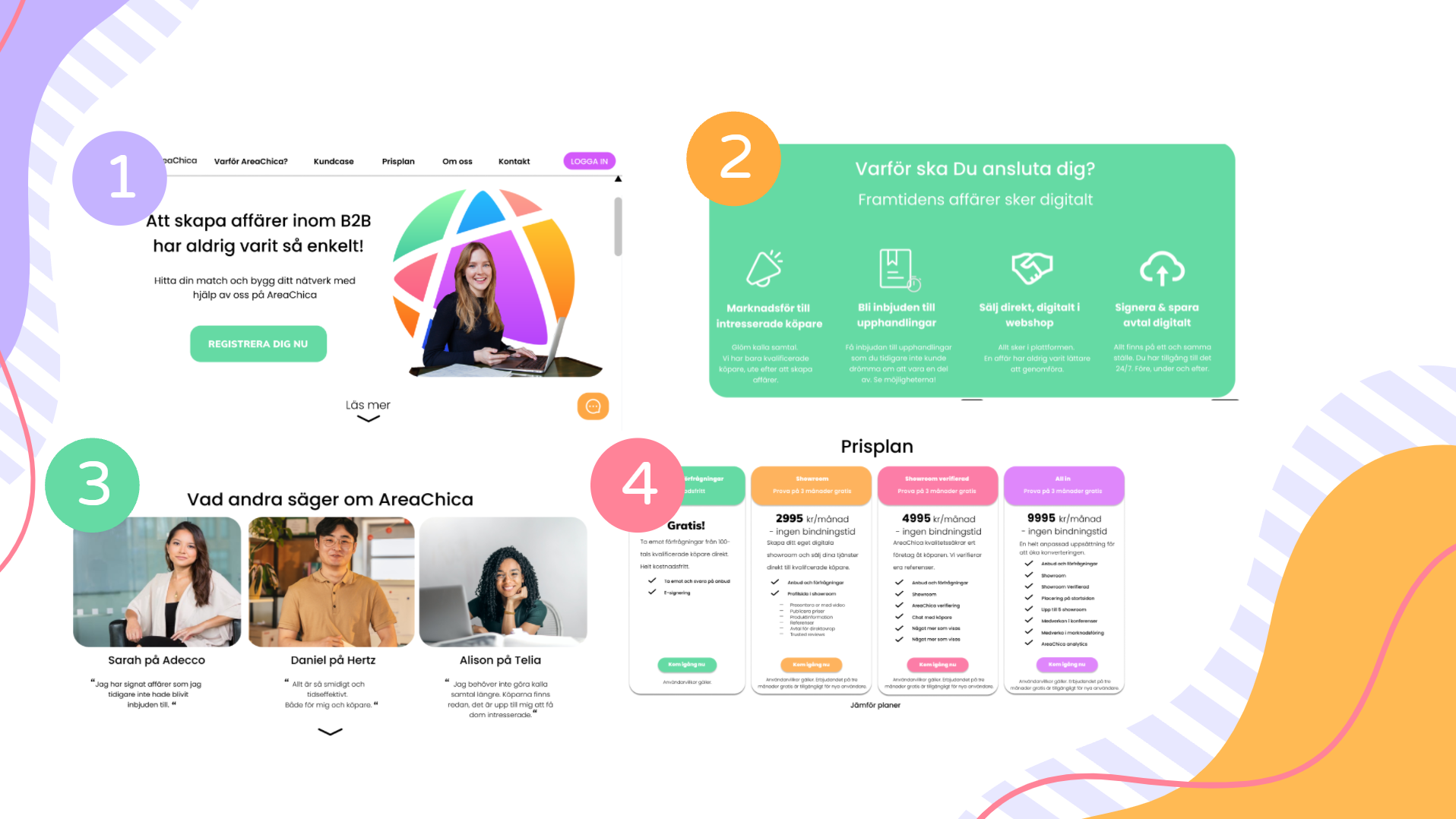
1. A welcoming atmosphere
Entering the homepage should feel welcoming. It should feel positive, fresh and exciting, but at the same time be professional. After all, it is a platform for work.
Everything our test users felt they needed to know can be found in the menu bar.
Two sentences describe the value of using AreaChica. The register button is clearly visible.
2. Reasons to why you should register
We wanted to explain and motivate the user to register. To create that we kept the text short and concise with relevant words for a seller. The icons is there to help symbolize the process to provide clarity.
3. Customer cases
Already available today on the existing website but is located far down the page without any pictures. In our user tests, it has been shown that customer cases are important for users, primarily to understand what experiences other people have of the product but also to make it feel real. It is important to have pictures of people to make it feel real. If it is possible to contact the people, that is another plus.
4. The price plans
Is very similar to the existing version but we have changed the text so that the most expensive one has the most content. In our version you can also click on "Compare plans" where it is clearer what is included and what is not included in the different plans.
Our design - registration process

Keep it simple
We choose to focus on the essentials. In our solution, the test users hopefully chose to register because they have a relatively good idea of the service. The more perception they have of what you get, the more likely they are to complete their registration.
Compared to AreaChicas current registration process this focuses on the most essential questions such as name, email-address, company name, organisation number and password. The rest of the information that is needed happens first when the user is already registered.
Our design - learn the value of the platform
Education
We offer the option to start a tutorial immediately after registration is completed. It goes through key elements of the platform but also the creation of a company profile published to AreaChica's showroom.
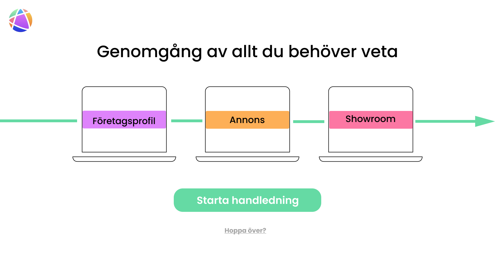


- This solution clarifies the onboarding process and gives the user the option of learning more at an early stage.
- It focuses on what sellers need to do to to be able to start making business in the platform. The same procedure would work for buyers too, but with other tutorials that are aimed for the target group.
- We present AreaChicas colour scheme in the tutorial to create acquaintance with the user.
- For sellers, the focus is on using the platform to increase their sales. Thus, we connect the company profile with the creation of ads.
- At last we wanted the user to understand that their information end up in AreaChicas showroom, a place where all potential buyers start when trying to find a company they want to make business with.
- In our user tests we saw that choosing a tutorial gave motivation for users to start creating their company profile.
Our design - homepage after registration

We want the homepage after registration to be welcoming and an overall place for the user to have as a base. For new users of the platform, the left menu shows what has been completed and what is left to do. We call it To-do.
The to-do list is divided into three sections;
- Registration
- Creating a company profile
- Creating advertisement
The first thing the user sees is that they are done with registration. There is a checkmark and the progress bar is 100% filled. It always feels good when you've managed something from the start.
In the example to the right, the user have managed creating a company profile which means that more tasks in the to-do-list is marked.
Users can also click into specific tasks in the to-do list, all to make it as easy as possible to nudge the user in the right direction.
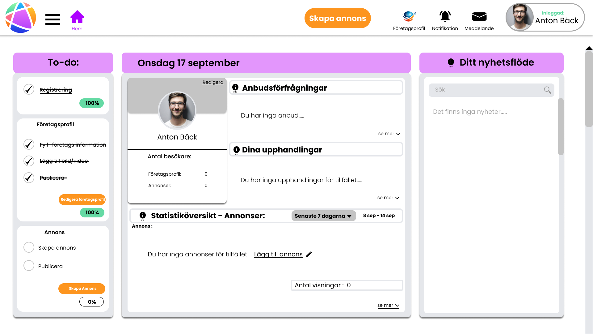
In the middle section, there are three headings;
- Requests for quotes
- Procurements
- Statistical overview - Ads
It was these three features that our test persons found most interesting to see in their feed.
We also added a profile section on this page. The user could look up intersting statistics regarding number of visitors to the company profile and ads which hopefully correlates. If not, sellers need to review the content.
Our design - company profile
Here's our redesigned version of what a company profile might look like. We've chosen to work with icon and images to make the interface modern and interaction-friendly. The user should see the company profile develop right in front of their eyes by adding text, images and video.
We also received suggestions from user tests to highlight forum activity and number of deals made on the platform. Both suggestions are integrated to increase the interest of people looking at the profile, but also for the seller to be more active on the website.
We have also created a new feed on the right side dedicated to the companys created ads and
received reviews from others. This makes it easy for visitors to get an overview of current events,
see reviews and do business.
When the user has entered the information needed the company profile is complete. The user can preview how the profile will look like before publishing it to AreaChicas showroom.
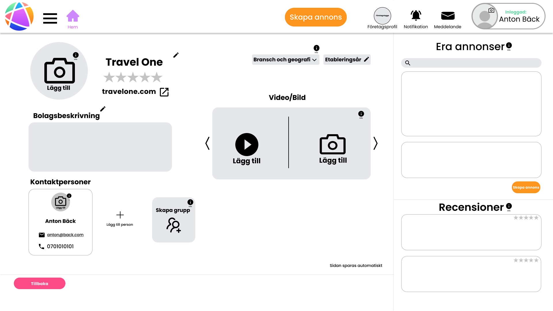
Image showing a company profile before the user has added information.

Image showing a completed company profile
Results and feedback
After our presentation to the stakeholders at AreaChica we received good feedback. They liked that we had looked at the overall concept of the platform. That we started the customer journey on the homepage and followed through all the way to the user creating a company profile. They hadn´t expected that we would look over the homepage, but for us it is part of the experience and, a very important experience to get right.
Apart from that we also received good feedback on some of the triggers we had built in at the company profile, making the platform more gamified.
Some comments from our work;

“The work done by Denise and the group was above all exectations. Their input truly guided us to make critical changes that have immediately paid off. It was an absolute pleasure to work with creative proffesionals."
Anton Muhrbeck,
Co-founder & CMO at AreaChica
“In-depth insights! You stay way from the superficial and generic and are really interested in the needs of the users. Very professional! You understand what UX is all about!”
David Snow,
Teacher and Principal UX at David Snow Design AB
“The best thing about your work was that you were totally open for insights and allwed yourself to explore the problem area, endeavouring to remain insecure and exploratory, thereby enabling the deep and specific insights!”
Jan Bidner,
Teacher and Chief Executive Officer at Bidnerdonethat